A new era for wayfinding design
The way we use spaces is changing — it’s time for wayfinding to catch up. Design agency DNCO discusses navigating an evolved time.
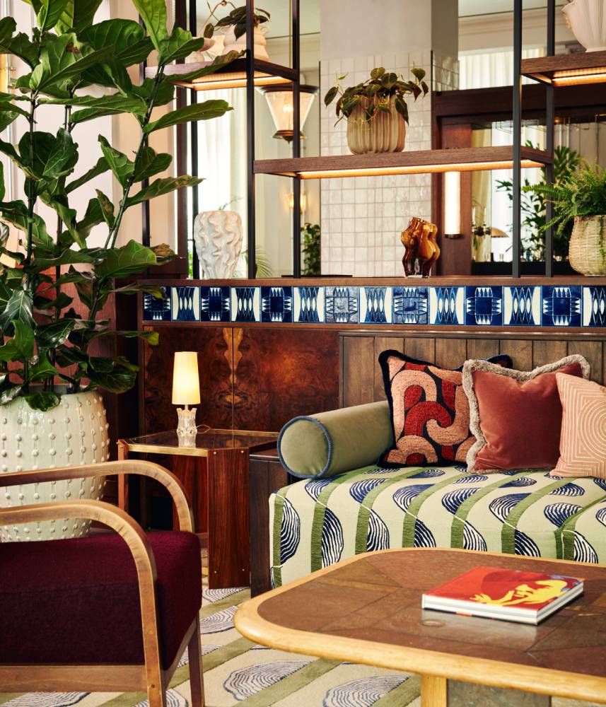
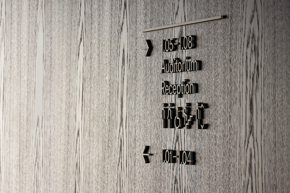
 THG Ingenuity campus
This article first appeared in Mix Interiors #222
Words: DNCO
The way we use offices, shops, museums, and other buildings has changed enormously in recent years. Some changes, like signs indicating one-way systems during the pandemic, have been temporary but others will permanently affect our experience of spaces. Wayfinding – signage and navigation – therefore needs to adapt to consider our changing use of space. A building can be impeccably designed, but bad wayfinding can completely ruin your experience, whether it’s the confusion felt on not being able to find a toilet or the genuine dangers posed if people can’t find emergency care in a hospital.
One of the most significant changes in how we use spaces has been the increasing demand for flexibility. This has been most obvious in workspaces – where traditional cubicles are being ripped out left right and centre to make way for moveable desks and collaboration spaces.
As companies grapple with hybrid working, many are undertaking office redesigns or even downsizing altogether and implementing hot desk policies. At DNCO, we have been approached by numerous organisations wanting a refreshed wayfinding system following a post-pandemic refurbishment.
The war for talent is also having its effect, with some employers looking to make their offices more appealing; for example, by having meeting rooms that can be flipped to host yoga classes at short notice. Signage is therefore having to become much nimbler to cater to a world of work in flux.
However temporary signs, which are chucked away after use, are at odds with another key ambition we see influencing the property industry: the desire to create and operate spaces more sustainably. Some have proposed digital signage – information displayed on electronic screens – as an alternative. These wayfinding alternatives are an expensive solution: the kit is costly but so is the management of it on an on-going basis, people often don’t consider this.
 THG Ingenuity campus
Another solution we at DNCO are exploring is projected lighting – which can be adapted to illuminate different text or icons onto a buildings’ walls. IKEA uses projected arrows very successfully in their Marketplaces mazes, while we are implementing it in the rather more elevated environment of an upcoming office scheme with flexible workspace in Central London. The office’s signage can be updated at any time without the need for new materials. This is particularly important for a scheme that incorporates a significant amount of flexible workspace – meaning company names can be changed at short notice. These changes in how we are thinking about signage tie back to the fundamental principle that should underpin all wayfinding: human behaviour.
When undertaking a project, the first thing we do is try to understand how people use the space – when and where they will be making decisions about where to go. If the building is already complete, we’ll undertake rigorous interviews with people who use it, finding out where the ‘pain points’ are; where confusion and wrong turns take place.
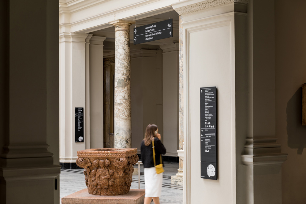
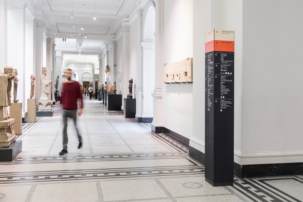
At the V&A, where we did the wayfinding for its seven miles of galleries, the biggest problem was how overwhelming the space felt. For a day visitor, six floors felt like too much and the top ones were often overlooked. We couldn’t change the building, but we could make it feel more digestible, so we renumbered the floors (-1, 0, 1, 2, 3, 4) and redrew the map. Anecdotally, the top levels now get much better footfall. For a refurbishment or a newly completed scheme, speaking to existing users isn’t possible. So instead we engage closely with the end user or developer to find out how they want the space to be used.
When designing the signage for Schroders’ new office, we learned from the company that it wanted to differentiate the upper floors, which are for quiet meetings with private clients, and the lower floors for team collaboration. So we created a unified, consistent language which could vary in tone across the two areas. On the client-facing floors, we selected an elegant hotel-style treatment in keeping with tp bennett’s interiors. Anodised waterjet-cut aluminium letters with hidden fixings were chosen to complement the refined material palette. On the lower floors, we could be a lot more expressive and playful. We installed fluted panels – riffing off the architecture – with icons on top and flashes of colour that picked up on the interior design.
When designing wayfinding, it’s critical not to overlook the natural cues humans perceive when deciding which way to turn: light, sound, smell and so on. Rather than working against them, we work with these to make our systems even clearer and even omit signage when we believe the natural cues need no enhancement.
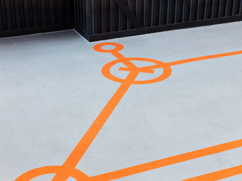
For commercial buildings, it’s also important to reflect the character of the company and space. At Here East, a tech and innovation campus in the Olympic Park, we borrowed from the language of electronic circuitry familiar to the campus’ digitally innovative community to create a wayfinding system that would be both inspiring and intuitive to this specialist audience.
Directional arrows show the flow of energy (here: movement). Reception desks are gateways to the next area, or transistors. Motors signify lifts. As in a circuit, the symbols are joined by lines to form a giant floor graphic connecting the whole campus.
Working collaboratively with architects to ensure signage complements rather than detracting from or overpowering the building itself is key to successful wayfinding – and our close relationships with Hawkins\Brown, MAKE Architects and tp bennett were pivotal in shaping our work at Here East and with Schroders.
Another way our use of space is changing is the increasingly digital nature of our experience, whether it’s navigating a city via Google Maps or being able to book meeting rooms at the touch of an app. We are starting a project with a university where they use mapping software across the campus, so we are looking at ways to make the wayfinding work inharmony with this to strengthen both at once.
Hardly anyone has yet capitalised on the digital potential of wayfinding. If we navigate external spaces via our phones, why not interiors? Clearly there are drawbacks. We cannot expect all people to carry a smartphone – having one’s head buried in a screen detracts from the experience of being in a building and interior digital wayfinding relies on signal strength which doesn’t always work within structures because of thick walls.
App-based wayfinding may not be the future, but either way, exploring it is important and reflects the role that we as wayfinding consultants have to constantly examine and re-examine how humans navigate space.